Organisational Charts-Story or Process?
What does your organisational chart look like? What does it say to your team and your stakeholders? Many look very similar whether it’s a flat hierarchy or a multi-levelled one they all intimate a certain hierarchical view of the world.
A few months ago my eye was caught by an illustration in a newsletter of an old organisational chart developed for a railway system. You can see it here
How beautiful is that? No wonder it caught my eye! It’s not just beautiful though, it tells a story. A story of connection. A story of the organisation matching its purpose. And I wanted something similar for BECBC.
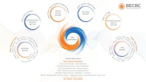
Now I know what I want but turning that idea in my head into something that makes sense to other people’s heads is a different matter. Thankfully I have a Toolbox. Conversations with Kate from Business Toolbox Cumbria turned my dreamy words into a reality that again tells a story of connection and an organisation matching its purpose. You can see it in the main image.
Kate helped me pin down the core messages I wanted to convey in this image:
- Members are at the very centre of BECBC
- Energy is in our DNA so this couldn’t look boring!
- There is a circular connection across the whole organisation
- We are not hierarchical
So look at your organisation chart now. Is it reflecting the story of your organisation? Or is it a process?
I think Kate aced it-what do you think?
Log in to leave a comment